The logo represents visual identity of a brand, and its creation requires careful research, strategic production and proper design selection. The main feature and function of the logo is to distinguish the brand from the competition and make it recognizable.
According to the established definition, a logo is a graphic form of company’s name, and the basic elements of a logo are typography, visuals and colors. However, the definitions are not enough to explain what is behind the design of the company logo. So, when asked what is the correct, ie. the best choice of design, there is no correct answer.
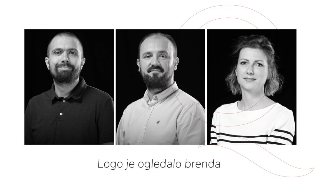
Our team of graphic designers, with years of experience and expression through creative design, has now expressed themselves in words, explaining that the logo is (not) a mirror of the brand. We talked with Marina Jungić, Dejan Jović and Aleksandar Živanić about creating logos, types of designs, necessary changes, but also about new technologies and their contribution to the field of graphic design.
What exactly should the logo represent?
Dejan Jović: Aim of a logo is to identify a product, service, person.
Aleksandar Živanić: Client, product, wool weaver, sports team, cheese factory. However, I wouldn’t say that it is a mirror of the brand, rather it is a small drawing of a company that wants to become a brand.
Marina Jungić: The logo should depict and represent the brand, as a visual identity. It allows users to understand who you are and what you do. Creating a logo is one of the most challenging parts of graphic design.
How does the logo affect brand awareness?
Marina Jungić: A good logo should have a design that conveys a true image of your brand, style and typography should be in line with your identity, the name of your company and the appropriate choice of colors. Thus, branding strategy and tactics help companies build, not only corporate identity and brand personality to differentiate themselves from the competition, but also brand loyalty. Over the years, they develop the brand personality, and in return receive a customer response.
Dejan Jović: Example of the equation: logo + work on the brand = brand awareness. Working on a brand would mean keeping the promise given to customers, improving the product or service.
What is the best composition when creating a logo, what should every designer pay attention to?
Dejan Jović: The golden ratio is something that has been a trend in logo creation for some time (maybe a decade), but it is not necessary the only way to approach the design. It is important that the sign is as recognizable as possible, and it is necessary to take care of the appropriate colors, typography.
Marina Jungić: There are no rules in design, and that applies to making logos as well, and that is one of the special charms of this job. The logo should be simple and clear. It should not have too many colors (the logo should look equally good in one color as in color), or effects and should not have more than two fonts. These are some basic rules that, again, do not have to be exact.
Aleksandar Živanić: There is no such a thing, it is important to pay attention to the context.
 What does your logo creation process look like, what do you pay attention to?
Marina Jungić: The process itself has several phases. The first phase is to explore the area in which the company operates, followed by sketching and image assembly phase. This one can take a while. The final phase is the selection of the right colors and typography as well as the application to various materials in order to create a clearer picture of the final appearance.
Dejan Jović: I write down or sketch a couple of ideas, then research to see that something similar does not exist, selection of appropriate colors and typography.
Aleksandar Živanić: Extensive research is crucial, but the process itself requires a lot of work and effort.
Is the logo something that is carved in stone or is it better to “refresh” it over time?
Aleksandar Živanić: Of course not, and it can be redesigned if necessary. My opinion is that if it is not really necessary, then we better not. Again, context is crucial.
Dejan Jovic: Not necessarily. I dare say that there are no world-famous companies that have not changed or refreshed their logo.
Marina Jungić: A good logo lasts forever. Of course, it can always be “refreshed” at some point, but the brand must be well known in order to decide to do so. A good example is the evolution of Starbucks’ logo. It retained its recognizability, but became more modern and minimal over time.
What do you think about sites like Canva and Wix, that do “easy logo design solutions” for users?
Dejan Jović: At the moment, I think those sites are primarily intended for startups or small businesses that cannot afford an agency or freelance designers, and as such they do their job.
Marina Jungić: These are instant services that can meet current needs. They are primarily intended for social networks and creating content on them. No serious brand will use those sites, but should seriously approach the creation of their visual identity with experts.
Aleksandar Živanić: New technologies bring cheaper and simpler tools, available to almost everyone, which inevitably leads to flourishing of mediocrity and a generic approach to design.


